Write and design your landing page call-to-action


The driver motivating your audience to complete that goal is your call-to-action (CTA) button. It’s the tipping point between conversion and losing the viewer.
It’s not just the shape that makes up the button. It’s the copy, the size, the contrasting color and more that come into play when getting your audience to convert.
When crafting a CTA, there is no one-size-fits-all solution. Each landing page has a new goal and audience and therefore, needs a new CTA.
Let’s get into how to:
-
Write CTA copy
-
Types of CTAs for your landing page
-
How to design your CTA
Writing Call-To-Action Copy
Your messaging matters. Sometimes all it takes is one small tweak to make a big difference in your conversions.
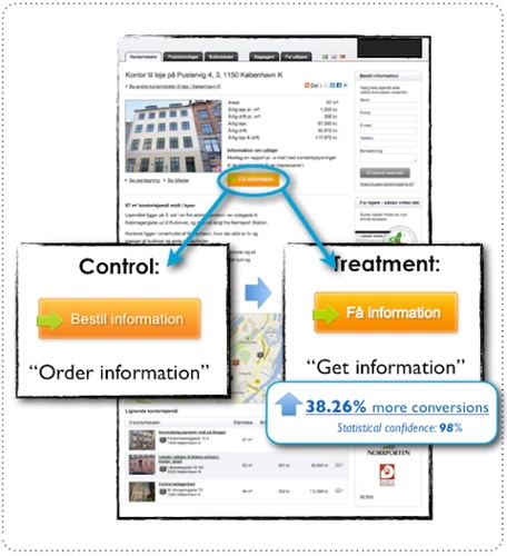

Image: Unbounce
As you can see above, changing the copy from “order” to “get” resulted in a 38% increase in conversion. The reason is instead of telling the viewer what they had to do to, they showed them what they were going to get when they clicked the button.
Your copy needs to reflect the value that your audience is getting by clicking on that button because they need a reason to proceed forward.
Tell your audience exactly what they’re going to get when they click the button. Let’s say your landing page goal is to get your viewers to sign up for your yoga studio. Using copy like “Find your yoga studio & get membership” is much more specific than just “Get your membership”.
“…The more value and relevance you can convey via your call-to-action copy, the more conversions you are likely to get.” – Michael Aagaard
Now, with goals, value and relevance in focus, here are a few tips to kick your copy up a notch:
-
Be brief. Why use 10 words when 4 will do? Five is the ideal maximum.
-
Start with a verb (register, download, subscribe, etc)
-
Avoid filler adjectives (awesome, great, killer, etc)
-
Be clear and specific (download my ebook now vs download now)
-
Use prepositions (for) and articles (the, a) to make the copy flow
-
Focus on what your target desires
-
Use “Now”, “Today”, “Instantly”, etc. to create a sense of urgency, but don’t be spammy about it
If your CTA needs a bit more explanation, try adding a short statement right near the button. Place it either above or below and make it smaller than the button text.


Not only does Credible add “Hurry before rates rise!” under their CTA to expand on the CTA purpose, it also instills a sense of urgency.
There are multiple types of CTA buttons you can use on your landing page (and throughout the rest of your website) that target different levels of the sales funnel.
Types of CTAs
Lead Generation
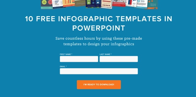
This type of CTA is at the top of the marketing funnel, where you turn visitors into leads by asking them to download a lead magnet (whitepaper, ebook, templates, etc.). This audience is new to your website and product. This CTA offers them a benefit in return for an email address which you can later use to introduce them to other resources on your site.

Lead Nurturing
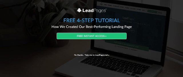
Use this type of CTA when your viewer has expressed interest in your product but isn’t ready to buy. Use a tailored landing page to direct them to an offer that is more aligned with what they’re looking for, like registering for a free trial or watching a demo.

Closing the Sale
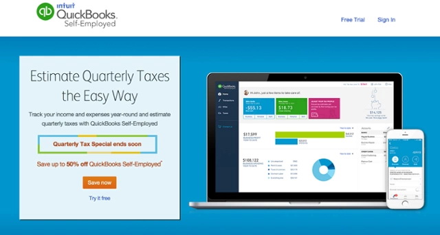
This CTA is focused on getting the audience to buy now. They have turned from visitors to leads to warm leads and are at the end of the funnel, ready to convert and buy your product.

CTA Design
There are a few very important elements to CTA design: placement, look & feel, directional cues and white space.
Placement
If you have a long form landing page, repeat your CTA in multiple places, usually above the fold and at the end. If the prospective lead read all the way down your page, make it easy for them to convert by having a button right there to click on.
If you have a short landing page (all of the copy above the fold), place the CTA in the most logical area that works with the rest of your landing page elements.
Unsure of what the landing page elements are, read:
Best Practices for Great Landing Page Design
Look & Feel
Your CTA button should stand out from the rest of the elements on your page. Simple ways to do this are to place the copy in a button (round, rectangular, rectangular with rounded edges) and make the button color contrasting to the rest of the website so it pops.
Make sure the size of the CTA is larger than the other elements on your page so it clearly stands out, but keep a balance, don’t make it so big that it takes over the page.
To step it up one more notch, give the button a hover color (when the mouse scrolls over it, the button changes color). Add a border or slight drop shadow around the edges. Include an arrow directly in or on the button as a directional cue. Give the button a gradient color instead of one solid color.
These are different elements to test out. I do not recommend using all of them on your button at once, otherwise it will start to look spammy.
Directional Cues
Since humans are visual beings, we subconsciously follow the direction faces are pointed in or the way eyes are looking. How many times have you seen a crowd of people looking off somewhere and you stop to look too?


Image: Wishpond
Based on the heat map, see how much more focus the product got when the woman’s eyes are staring right at it? Test using an image of a person that is focusing right on your CTA.
For something more obvious, try using an arrow that points directly to your CTA, or one in the button itself.
White Space
Add extra white space around your CTA to help it stand out from the rest of the landing page. This also helps make it much easier to spot on your page.
Testing Your CTA
Test your CTA! It’s very simple to swap in new copy (or design elements ) to see which performs better. For example, try using modest copy (“Support Our Cause”) versus more urgent copy (“Donate Now”). Try using Visual Website Optimizer. It’s an easy tool to track performance.