An improved checkout experience makes both student and creators’ lives easier
As business owners, you all have your own set of personal goals and metrics you want to hit. But, to run a successful business, one metric is always on the table—the sales conversion rate.
The sales conversion rate is a measure of how well your website is performing in order to get your visitors to purchase the product you’re offering. The higher your conversion rate, the more sales and revenue you’re making. As your business partner, we value your conversion rate too.
As you work to improve the messaging and offer on your sales page, we have been working on ways to improve our checkout experience to boost conversions. With the work our team has implemented in July, we’ve seen an overall 7% increase in conversion rate on our student checkout.
Let’s dive into our work over the last few months to see how we did this.
Clear options, more payments
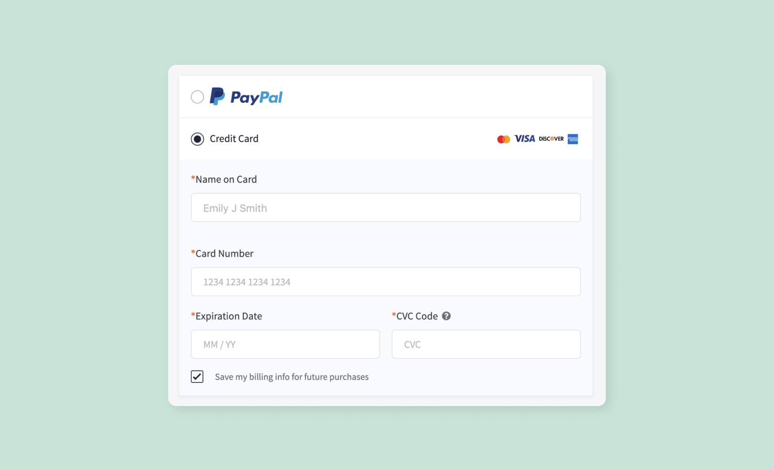
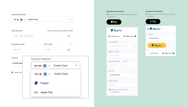
On the checkout page, the priority is to make it easy for your audience to understand how they can pay for the product. Our checkout pages used to default the payment method to credit card payment, leaving all other payment options hidden under a dropdown.
In our research, we realized that while this helps make the page cleaner, it is not immediately clear for users to know what other payment options they have access to. This particularly affects users purchasing from countries where credit cards are not the preferred payment option. We also wanted to simplify the steps your audience takes when using Apple Pay or Google Pay.
To reduce friction and make all the payment options clearer to your audience, we decided to change the designs from a dropdown list to radio buttons. In one glance, your students now know all the different payment methods that are available to purchase your course.
Testing and learning
We’ve also done a lot of testing and learning on how to add additional elements—billing and delivery addresses—to the checkout page. Sales conversion rate is important to your business and to our business. For any changes we make, we want to take a very responsible approach to ensure that it doesn’t negatively impact any of you.
We ran the experiment with the assumption that adding a billing address to Checkout will have a neutral impact to conversion in the US since users are already familiar with this experience. This might have a negative impact on conversion internationally because we were not localizing form fields for each country (i.e. not removing state).
So, we ran an A/B test to see how adding a billing address would impact the conversion rate. We did this by showing 50% of users on checkout our existing design, and the other 50% of users on checkout our new design with the added billing address.
Our assumptions were right. While the conversion rate in the US did not observe any significant difference, there was a small negative impact on conversion rates for international users.
Based on our findings, we put together another design that simplifies the address section for international customers. With this new design, we ran the A/B test again, which resulted in no significant change, to ensure that we were moving in the right direction.
Tidying up the page
When we decided to make design improvements to the payment methods, we also took advantage of the opportunity to review our page design and user feedback. In our research, there were a few things that stood out to us:
-
Coupon code field
-
Subscription frequency
-
Country dropdown
-
Additional terms and condition checkbox
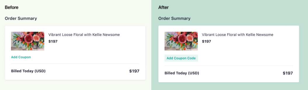
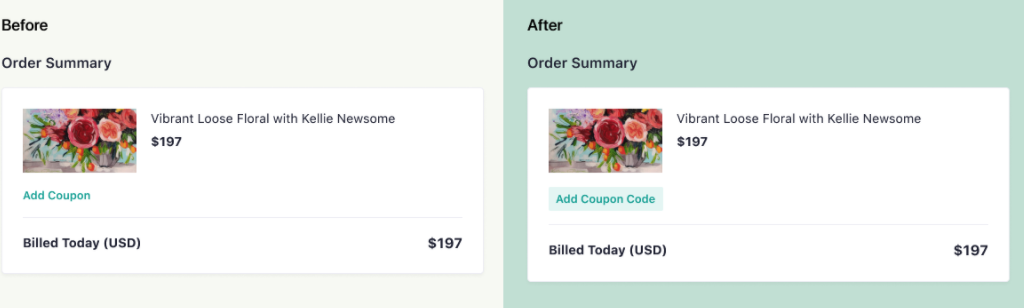
Based on user feedback, there was a lot of confusion around where to add coupon codes or what the billing subscription frequency was. In observing user behavior, we noticed the extra steps audiences had to take, such as updating the country field and clicking the terms and conditions checkbox. To solve these confusions and reduce the steps on checkout, we added design elements to highlight the coupon code, clarified the copy for billing frequency, updated to auto-select country dropdown, and included the terms and condition copy.
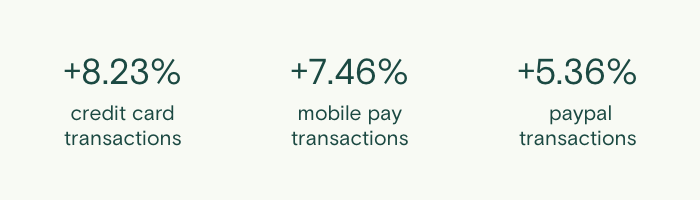
Since we rolled the new payment method designs and made small improvements to the page, we’ve seen an overall 7% increase in sales conversion rate on our checkout pages. Specifically, we saw an increase in sales conversion rate of 8.23%, 7.46% and 5.36% for credit card, mobile pay, and PayPal payments.
Always getting better
Just as your work doesn’t stop when you hit a business goal, our work doesn’t stop here either. We are still monitoring how the checkout page is converting for you, how we can continue to improve it, and what new features we can add.
We look forward to sharing more behind the scenes decisions we make and new updates soon.
An engaging homepage is the face of your online brand. Make sure it’s up-to-date with our free “homepage checklist.”